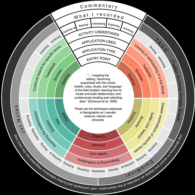
One of the questions I’ve found the toughest to answer throughout my study is ‘what do you do when you do Twitter?’ Or, more specifically, ‘what does participant observation look like in the context of your research?’ I’ve previously responded at length, and have been trying to capture a sense of what I do within a single visualisation. I’m still not convinced I’ve quite managed it, but here’s the final version which made it into the thesis:
With the majority of participants (it seemed) coming from creative, art-influenced disciplines, I wasn’t sure whether this was the right arena to talk about my research. I needn’t have worried. Apart from the main speakers, many of us were doctoral students, so had that instant shared sense of experience. And of course we were talking about our methods, which arguably has a more universal appeal.Read More »
I’m in the midst of a modest attempt and first few tentative steps at getting my work out there. Over the past couple of months, the details of several symposia aimed particularly at early career researchers have dropped into my Inbox. I submitted abstracts for three and was fortunate enough to have them accepted. In each case, the theme spoke to a specific aspect of my work, thereby providing an opportunity to focus on several, small aspects of my thesis.
At the beginning of June I attended “Adaptive Ethnographies for a 21st Century Sociology” arranged by the British Sociological Association at Royal Holloway, University of London. I spoke about how I’d employed visualisation for data recording and analysis as a strand within my ethnographic approach, rather than how the vis is commonly purely a presentation device. I tried to argue that analysis was an element which receives less attention than the conducting and writing of ethnographies, and that producing visualisations can be one way of supporting the analytical and interpretive processes..
I knew that a week away with friends at Easter would help to recharge the batteries, but was conscious that I had impending deadlines. I’d also narrowly missed my target deadline of Easter to get the first full draft of my thesis in to my supervisors, but that was my target. Last week then was all hands on deck to get a poster for the follow-up SHU SIPS doctoral poster event handed in for printing. That was followed by a concentrated effort to complete the last few thesis sections, whilst simultaneously gathering the elements I needed to assemble the image I would be handing in for the Doctoral Research Image Competition … which brings me to this week.Read More »
Here at SHU there’s a couple of PhD researcher competitions on at the moment as part of the forthcoming Doctoral Showcase series. There’s the ‘Three Minute Thesis’ heats and local final, but the one that attracted my interest was the ‘SHU Doctoral Research Image Competition 2018.’ I’ve been producing visualisations throughout my study and I had in mind one I wanted to produce, but hadn’t because I knew it would suck up time. The competition provided the final impetus and although I suspect from the information and instructions, the organisers are expecting photographic images, I thought I’d have a shot at pushing the boundaries.
We welcome attention-grabbing images to intrigue, inform or excite a lay/non-specialist research audience about your research. Images may be arresting, beautiful, moving or even amusing but they must relate to your doctoral research project.
Entrants are also allowed 150 words of accompanying text; here are mine:
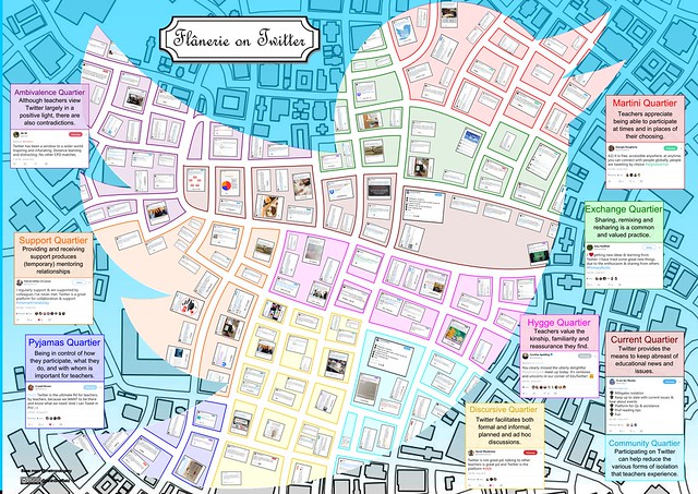
The flâneur of 19th Century Paris was an observer and chronicler of city life. In exploring the bold claims some teachers make that ‘Twitter is the best PD ever!’, I called on the spirit of the flâneur to guide my ethnographic approach.
One of several methods I employed in the study was participant observation; this image is formed from tweets collected during that process. Each of the districts or ‘quartiers’ contains tweets on one of the emerging themes, each typified by a magnified example.
Since flânerie inspired my approach to observation, analysis of the data, and presentation of the findings, I sought an image which spoke to that activity. Although somewhat playful, creating this image, and other visualisations during the study, was more than simple representation. On each occasion I found the attention to compositional detail which was demanded also yielded additional analytical insights.
Clearly no marks for originality, but there’s my first tweet. Those which followed illustrate that Twitter for me was more about learning with and from other educators. It still is … but I digress. As I’ve been analysing the data from my research, the routes by which people come to Twitter to support their learning are rather different. My tweet above was at 18:33 on the 19th February 2009, and was prompted by a fellow Master’s course member, Geoff, who suggested I might find Twitter interesting. The path for me then began with a course (Technology Enhanced Learning, Innovation and Change), followed by a nudge from someone whose opinion mattered. Can you remember the route by which you came to use Twitter to support your professional learning?Read More »
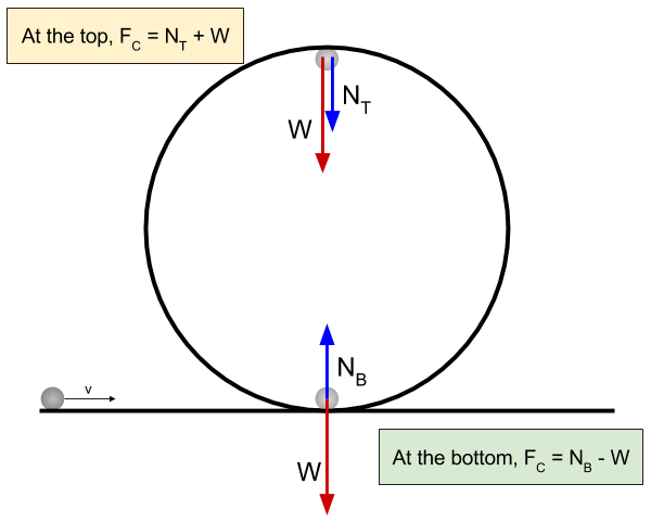
Having decided to attempt to describe certain phenomena on Twitter as learning assemblage, I now find myself in somewhat of a quandary. Earlier yesterday, whilst teaching a group of undergrad BEd with Science QTS students about circular motion, we were discussing the importance of sketching free-body diagrams to aid understanding and problem solving. So perhaps it’s the scientist in me that generates the proclivity to want to summarise situations by using visualisations of one sort or another. A quick scan through the back catalogue of this blog will reveal many examples, however I now find myself struggling and somewhat dissatisfied.
I’ve recently been drafting vignettes in which I describe groups and activity on Twitter as assemblage, but I feel the need to produce a visualisation which captures a sense of what that is. The problem of course is that I’m trying to render assemblage, a dynamic process, as a static representation. But why should that be a problem? That’s precisely what I’ve been doing when producing physics free-body diagrams isn’t it? Representing a dynamic situation through a static diagram?
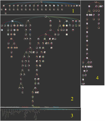
Using the Treeverse application I mentioned in the last post, I’ve now gone back through my field notes to some of the exchanges I came across during my participant observation. Some were brief and some were longer, but Treeverse provided a rather different perspective, and in several cases brought in some tweets that DataMiner hadn’t captured. In addition to being able to get a better sense of how the exchanges unfolded with time and being able to quickly swap between different threads, the tree view provides an immediate snapshot which is informative in itself.Read More »
ProPEL 2017 has drawn to a close and I find myself writing this with my head still spinning from the volume of information to which I was exposed. Three keynotes, seventeen papers and a multitude of less formal conversations over coffee and meals. And of course I presented the paper I had submitted: “Professional learning(s) beyond the workplace; Teachers’ learnings with Twitter.” I have to confess to being slightly more unsettled than I normally would be when attending a conference and this doubtless partly due to putting my thoughts out there for the kind of scrutiny which I’ve never experienced before. That of peers and more experienced academics who are in most cases, much more experienced in the field than I. It was a simple matter of the unexpected; how would my work (and I) be received?Read More »
In the preceding post I considered one possible way to visualise a Twitter exchange, but expressed concern that the temporal separation of events had become lost. Seeking to redress this shortfall, I thought that timeline tools might offer a way forward. So finding myself needing to ‘kick the tyres’ of TimelineJS, that’s where I turned. Here the data that you use to compose your timeline is kept in a Google sheet, which means that adjusting or amending your timeline only requires a change to the contents of a spreadsheet cell. It also makes consistency across the elements of the timeline relatively easy by cutting and pasting cell contents. Adding each tweet is no more complex than pasting its url into a cell.