Having set thesis drafting aside pending feedback from my supervisors, I’ve returned to my data … and each time I write that phrase ‘my data,’ it bothers me. It’s really not my data at all; I don’t have any particular rights over them, other than, with the help of a bunch of other folk. having assembled them together. Anyway, I’ve returned to my flânografie and am casting my eyes back over the notes I made during the seven months of participant observation. These were the episodes which appeared on Twitter, sometimes in my timeline, sometimes through using search terms on Tweetdeck and often as a result of someone pointing me towards a tweet or post they thought I might find interesting.
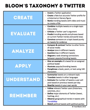
In this instance I have Andrea Stringer to thank for pointing me towards the blog post which prompted me to write this. “22 Ways To Use Twitter With Bloom’s Taxonomy” was written by Aditi Rao, @TeachBytes on Twitter. Usually when an item like this came into view, I’d make some notes describing what I saw and adding a few reflective comments. Back in January of 2017 when I read Aditi’s post, I remarked neither on Aditi’s brief introduction to the graphic, nor on its contents. What struck me more was the effect it was having on other people and how they might be learning from it. My attention was therefore drawn to the ways in which other people had interacted with the post and their reactions to it.Read More »
Susan Halford provided the opening keynote and reminded us that ‘data never sleeps’ and is being generated at ever increasing scales in real time and over time. Whilst this may constitute an ‘unexpected gift’, it’s meant we’re also ‘building the boats as we row’ in terms of the way we’re gathering and analysing those data.
Susan challenged us to consider three questions:
What are social media data?
Where are the data produced?
Why does this matter?
There is genuine concern that much of the current evangelism around Big data may have done more harm than good, leading to inflated expectations about what is possible and what we can learn. If we’re not careful, our reliance on the platforms through which we access the data may unduly influence what we find, in a host of different ways, and in ways which vary over time. Demographic and geographic data especially need treating with caution, or at least with care and in full knowledge of their limitations. Perhaps we should go beyond demographics and make a virtue of the biases, limitations and specificities inherent in the data.
I hope in a sense that is what my research is doing, where I’m focusing on a particular, self-selecting sample, engaged in a specific activity. For me, the demographics are in some senses pre-defined – teachers who using Twitter. What their gender, religion or ethnicity is, will be of no consequence since I’ll not be classifying my results using those criteria. Or at least I never intended to, until I though about location. I’ve assumed my participants will be teachers drawn from a global population, though due to my linguistic limitations, from the english-speaking world. The keynote has encouraged me to revisit my thinking; in different places (with different cultures?), might teachers have a different view of, and approach to, professional learning using Twitter?
Susan asked Les Carr, her colleague from Southampton, to join her on stage. Amongst other things, Les pointed out that vivas inevitably ask us to justify our methods and the data they generate, and how they are appropriate for the research questions we pose. I was grateful for that reminder as I begin to think about my RF2 submission. Duly noted!
This workshop session had us split into groups to each consider one of the six ‘V’s of big data: variety, value, volume, velocity, veracity and variability. The three hours were split in two, each part session opened by a number of speakers presenting the findings of the papers they had contributed to the forthcoming Sage Handbook of of Social media Research Methods. We were asked to consider our ‘V’ (we had Variety) in the context of any tension between Big and small data, if indeed there was any. Our table, as it transpired, consisted of social scientists rather than computational scientists, so unsurprisingly tended to focus on the positive aspects of small data.
I found the opening presentation by Claudine Bonneau and Mélanie Millette on their ‘small’ data projects spoke to my research – very much a hands-on, immersive, participatory approach, where tweets were collected and analysed manually. The approach within the long-term observation was described as ‘agile’, following the conversations from place to place. There’s a resonance for me in the way teachers shift between Twitter, #chats on Twitter and blogs when discussing their practice. I yet to grasp how or if I can or should incorporate the offline places where these discussions occur. There are clear sites of interest where teachers gather to discuss and share practice (TeachMeets etc); my problem however, will be whether I have the scope to chase them down.
I found the topic of ‘Working out Loud’ practice on Twitter had a close fit with my own research, although I was surprised that other professions also engaged in this practice (how insular am I?!). However, the most compelling aspect was how we ‘thicken’ small data, perhaps reducing its breadth whilst enhancing its depth.
Earlier this week, I had an appointment cancelled, which free’d up Wednesday. This mattered because an NVivo training course was scheduled for that day, and I’d been unable to attend because of my earlier commitment. As luck would have it, there was one place left, which i immediately snapped up … what luck! But at that stage, I didn’t realise quite how lucky.
The session was delivered by Ben Meehan of QDA Training, an experienced NVivo trainer, who promised us a rather different training experience to those we were perhaps familiar with. Although not quite as radical as we might have been led to believe, there were definitely some distinct differences between this session and conventionally-structured computer application training sessions. It’s not often you’re on such a course lasting only a day, where you don’t even touch the keyboard until after lunch! Nevertheless, that proved, for me, to be exactly the right strategy.
My context.
I wasn’t attending the conference as a complete novice. Given the approach I’ve taken to my research, at some stage I was going to need to collect, manage, analyse and interpret a wide range of qualitative data. With multiple methods (often within digital domains) generating several types of data, it made sense to me to seek computer assistance. Since the package to which the University subscribes is NVivo, I decided quite early on to begin to get to grips with it. There is plenty of helpful literature out there1, and a good number of YouTube videos; unsurprisingly some are better than others. I found this one particularly helpful:
Together, these resources have helped me become familiar with the the structure, features and a range of uses of NVivo; I could doubtless bring it to bear on my research and make (fairly) effective use of it. Although I’ve given it a good test drive whilst researching the literature and as part of my pilot methods study, I kept hitting snags and was convinced I wasn’t getting the most from it. More worryingly, I was concerned that I might set up a poor structure that would later require me to dismantle it and thereby increase my workload unnecessarily. The question was though, whether a course titled ‘Introduction to NVivo’ might be aimed at people with less experience. I needn’t have worried.
Structure of the day.
With its full title of ‘Introduction to NVivo: Building your database’ we can see how important this course will be in addressing the fundamental aspects of using NVivo. It was with this in mind that Ben devoted the initial session to discuss why we might want to use a computer to assist our qualitative analysis in the first place, and what the implications of that choice might be. He then asked to consider what data we were likely to be collecting and how they might be thought of as ‘cases’ so that we would be in a position to design a structure to organise them within NVivo. Time invested in this initial planning would pay dividends in later stages when we needed to conduct and test different levels of analysis across and through our data. Another crucial element in the design and build of our database is the analytical strategy we intend to adopt. This is where I became a little unstuck, as this isn’t an area I’ve yet devoted sufficient thought to, beyond using open coding, developing categories and themes, and synthesising the emergent concepts. I used constructivist grounded theory in an earlier study, but hadn’t really moved on from there. This session above all else forced me to confront my choices and whether framework analysis, content analysis, discourse analysis, interpretative phenomenological analysis, or indeed grounded theory are consistent with my epistemology. At the moment, I see virtues in several approaches and have to resolve whether it’s possible to draw what might be useful from each, or whether they are completely incompatible. More thinking still to do.
Having collected, analysed and interpreted our data, the next stage will be to report our findings. Within that reporting, in addition to the insights we developed, we will need to present and justify the decisions we made; once more NVivo can help with that process and help us to construct a more robust and credible thesis. By annotating, memoing and reliably entering pertinent metadata, NVivo can help us maintain a transparent audit trail connecting the findings we present back through the decisions we took, to the data where those seeds were sown.
We finally launched NVivo after lunch, when we were given the opportunity to put into practice much of what we’d discussed earlier. Using the data from an actual piece of research, Ben introduced us to all of the features and capabilities within NVivo which would allow us to implement the ideas we had developed in the morning. With the ‘why’ in place, the ‘how’ now made far more sense.
What I came away with.
Although my awareness of the NVivo environment and the tools within it didn’t advance far, instead I gained something of far greater value. I now have a much better appreciation of what my database could look like and how to begin setting that up. I know that my planning will be key and that that will have to be informed by the analytical strategies I choose.
As one might expect, we were provided with a set of resources we can refer back to; a workbook (printed and pdf) and data we can use to practice our technique. Less usual was the offer of access to ongoing support for the duration of our projects. We can get additional personal advice and assistance when setting up our projects or if we encounter any problems, either by email or when necessary through Skype and remote desktop sharing. Incredibly generous, a potential lifesaver, but precisely the kind of safety net many of us will need as our research unfolds.
What other people thought.
It was clear from the initial introductions that people were at a range of different places in both their research and their capability with NVivo. That’s very difficult for the person at the front to cater for, and yet I got the impression from those I talked with and from the gratitude people expressed at the close of the course, that most people, like me, had gained a great deal. Ben obviously knew his stuff and was able to draw from a wide range of experiences when answering queries from the audience. He never once sugar-coated things, nor over-evangelised the virtues of NVivo, but what he did do was set out the questions we need to answer and a path to follow when we have those answers.
1BAZELEY, Patricia, and JACKSON, Kristi, (2013). Qualitative data analysis with NVivo. Second edition / Pat Bazeley and Kristi Jackson.. ed., London, SAGE.
BAZELEY, Patricia, et al. (2000). The NVivo qualitative project book. London, SAGE Publications; SAGE.
GIBBS, Graham (2002). Qualitative data analysis: Explorations with NVivo (Understanding social research). Buckingham: Open University Press.
RICHARDS, Lyn (1999). Using NVivo in qualitative research. Sage.
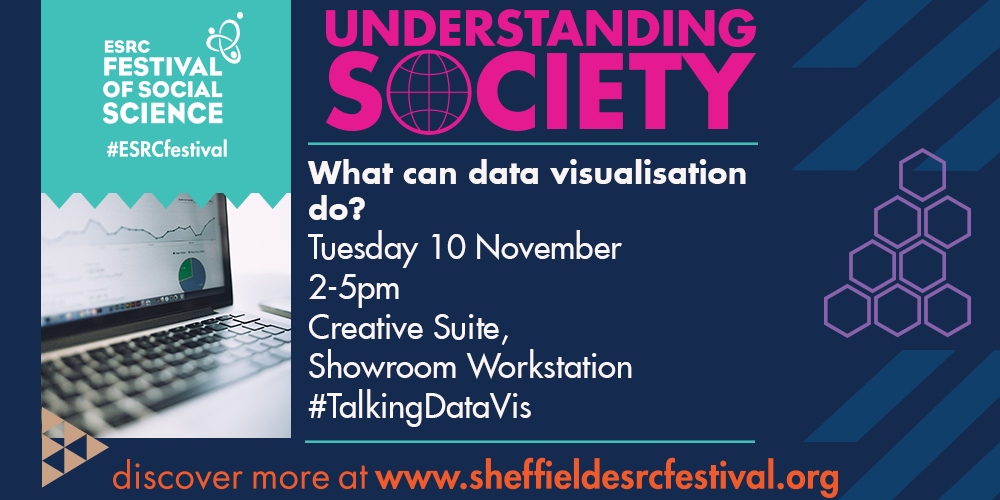
Yesterday the ESRC Festival of Social Science came to town; well OK, it’s been running for a couple of days now, but yesterday was the first events that I attended.
What can data visualisation do?
At the Showroom, this event arranged by The University of Sheffield provided four provocations on different topics, followed by a panel discussion of some of the issues raised. Alan Smith opened the batting by making ‘The Case for Charts,’ questioning whether charts were often used simply to break up blocks of text.
By Anscombe.svg: Schutz derivative work (label using subscripts): Avenue (Anscombe.svg) [GPL (http://www.gnu.org/licenses/gpl.html), CC BY-SA 3.0 (http://creativecommons.org/licenses/by-sa/3.0) or GFDL (http://www.gnu.org/copyleft/fdl.html)%5D, via Wikimedia CommonsUsing a bar chart from a UNESCO report entitled “Gender Parity Index …,” typical of the kinds of charts we often encounter in reports of this nature, Alan showed how it could be quickly amended to improve accessibility, ease of interpretation and simply allow the data to tell a more powerful story. Instead of being relegated to the tenth page, a few alterations meant that it could forefront the research from the front page; in essence, ‘start with a chart.’ He took us back to first principles and used Anscombe’s Quartet to illustrate why we need to use charts with care, but how a well-designed, but carefully chosen chart can obviate the need for swathes of text.
Next up was Thomas Clever who offered the contention that ‘Data visualisation was dead,’ of course qualifying that by showing how Big Data has disappeared from the download slope of the Gartner Hype Cycle, but actually become embedded within many other aspects of our everyday lives. We’re now becoming accustomed to being presented with visualisations in the media, through politics, at work and of course in advertising, although we’re perhaps not yet sufficiently sophisticated in the way we interpret and interrogate the data. It’s also becoming less visible and less controllable – MacData perhaps?
After the break the new presenters were charged with taking us from the general to the more specific. Valentina D’Efilippo described four of the projects with which she had recently been involved; there was even one I was familiar with – ‘Field of Commemoration.’ Though I would love to provide an image, I can’t find one with the right licensing, but I’d encourage you to try out the interactive version at Poppy Fields, commissioned as part of the Great War Centenary commemorations.
The final session was from William Allen at The Migration Observatory, who illustrated how data on a particularly hot topic needed to be portrayed in an as accessible a way as possible, for a multitude of audiences. The data at the Observatory can be displayed in any one of a number of different ways the user chooses, however despite the compelling messages it delivers, Will was dismayed by the extent that people were unwilling to accept the evidence in front of them. Even an impressive visualisation might struggle to unseat deeply held beliefs.
In the closing session hosted by Andy Kirk, the panel discussed what data visualisations aren’t (they were all unequivocal that infographics aren’t data visualisations – learned something new there), how they can help with memorability (making information stick), that good visualisations evoke feelings as well as facilitating understanding, but that the audience for visualisations isn’t yet sufficiently critical – ought data literacy to have a place in schools? (I offered an opinion of course!)
A couple of things struck me. Firstly that there are those in social media circles who are highly critical and dismissive when people make claims about ‘preparing today’s students for jobs which don’t exist yet.’ The four presenters today had titles which meant they could be considered ‘data visualisation specialists.’ I’m pretty sure that option wasn’t on the list of careers I could have chosen from, or even a potential career for the last cohort of students I taught. Secondly, how refreshing it was to see PowerPoint being used by people with more than a little understanding of the elements of design. Instead of delivering information, that much maligned tool was helping to tell a story; a lesson for us all there perhaps?
Foundational 21st Century Literacies
This session was perhaps targeted more precisely at educators, outlining ‘The Street,’ a project aimed at developing literacy skills of primary aged pupils. This was a collaborative venture between Sheffield Hallam University and teachers in a couple of local primary schools (Will Baker, Adam Bamber and Dan Power). The session was facilitated by Professor Cathy Burnett and Professor Guy Merchant, but I’m sure they’d concede that the stars were the primary teachers involved in the project who conveyed their enthusiasm with such aplomb
The premise hinged on teachers undertaking a collaborative project across two schools, but one in which their pupils would also collaborate, as they develop their literacy skills through the medium of a blog. ‘The Street’ was conceived by the teachers themselves, simply as an imaginary location from which a story would unfold; a story crafted by the students themselves. Minimal rudimentary information in the form of a brief audio soundscape was given to the pupils who could then decide what they thought the sounds evoked, in the context of a street. Working in groups, they then posted their thoughts to a blog, shared between the two schools. With a few occasional prompts to ensure the unfolding story addressed the learning intentions the teachers had, the pupils had free reign over which directions their story should take. The sense of empowerment and agency was one of the most powerful elements to arise from the project, together with how inclusive it had been at drawing in pupils who might normally be considered reluctant writers. This and many other positive aspects were used as a hook to encourage teachers in the audience from other schools to consider becoming involved in extending the project; as small clusters collaborating on their own projects, rather than extending ‘The Street’ to the point where it might become unmanageable.
In the discursive session where, in small groups, we were encouraged to consider the project from our perspectives, and in the plenary which followed, a few things piqued my interest. That there are still teachers unaware of what ‘green-screening’ entails and how it might be used in an educational context. I’m not sure why that surprised me; it is after all only a couple of months since I was working with teachers full time! It was somewhat disheartening to hear how poorly provided for some primary schools are in terms of technology – one school of over 500 pupils had nothing more than a single IT suite and sixteen iPads. That must be so tough for any teachers there who have the will and desire to push what they’re doing with digital technologies and media, yet not having the wherewithal to follow that passion. It is clearly too long since I was in our state system, but if that’s what folks are having to cope with these days (amongst other pressures!), I’m not disappointed to be out of it. I was heartened though that those teachers involved in the start of the project were all Twitter users, didn’t make a big deal of it and acted though it was a natural part of their practice. Perhaps there is hope after all.
Yes, I know! My research proposal suggests I’m taking a qualitative approach, so why would I be attending a conference focusing on quantitative methods? Well let me return to that shortly.
The conference was arranged by the Sheffield Methods Institute in collaboration with the
School of Education and Applied Quantitative Methods Network at the University of Sheffield. There were two presentations:
‘Using the Scottish Longitudinal Survey to analyse social inequalities in school subject choice,’ and
‘A multilevel longitudinal analysis of rich-poor achievement gaps in English schools.’
In the first, Prof Cristina Iannelli from the University of Edinburgh explained how they used the data within the Scottish Longitudinal Study to explore whether the choices students make in their curriculum subjects affect the likelihood of them accessing higher education. In particular the extent to which this is true for students from less privileged social backgrounds. In short, if you have a less advantaged background (neither parent with degree-level education), you’re more likely to follow a curriculum (aged 14 – 18) which disadvantages your chances of going to university. For example, there are some subjects which Russell Group universities demand; if you don’t have them you can’t apply.
In the second talk, Dr George Leckie from the University of Bristol described the multilevel method he used to interrogate the school performance data published by the UK government Department for Education. Seeking to establish whether the data can verify the extent to which ‘schools narrow the performance gaps between the most disadvantaged pupils in their schools and their peers.’ Using the data in their raw state from the school performance figures can be difficult to interpret and/or rather misleading; the multilevel modelling approach makes interpretations more robust and revealing.
Both talks were quite interesting from a meta-perspective. Yes the findings were of interest to anyone in education, including me, however they offered little to inform my study. Where they were much more useful (and now I return to the reason for me attending the conference), were in providing me with an insight into quantitative approaches to educational issues. Though I’m no statistician, perhaps the scientist in me nurtures an affinity for data. In particular I am fascinated by data visualisations and the way that complex numerical information can be displayed in simple, comprehensible, accessible and sometimes even beautiful ways. (See the work of David McCandless for example). I have to confess that although I understood the interpretations today’s speakers were offering of their data, I struggled to understand the statistical techniques they used to achieve their findings. It follows of course then, that I’m not in a position to question their assertions. That must also be the case for many other people too, including those on the bodies who funded the research possibly? Fortunately more capable individuals than me will be assessing their claims through the peer review process when their findings are published. I wonder whether though, because your results are processed using what to the public at large might appear to be smoke and mirrors, presenting your findings might be a tough sell? Given the skill and experience needed to be able to interrogate the data adequately, one wonders to what extent schools manage, given that they lack that expertise.
Takeaways
As I wrote earlier, I can see the allure of a quantitative ontology when you have a readily available source of data that might shed some light on a particular issue of concern, but for me, that’s just the starting point. I found myself asking why it is that Scottish students are disadvantaged by their curriculum choices and why some schools are managing to close the achievement gap between rich and poor, whilst others are not. How did I get here from a science background?!
As I mentioned in an earlier post, this was another opportunity to a) see how researchers go about presenting their findings and b) the pedagogy and process of delivering what amounts to a lecture. I’m minded to think that there’s an actor-network theory study in PowerPoint as an actant and how it translates teachers/lecturers. A future post perhaps?
When I recently became aware of NSMNSS (New Social Media, New Social Science?) via a YouTube video I happened by:
the first thing I did was to subscribe to their channel, followed swiftly after by following their blog. That was how I became aware that they have a monthly Twitter chat (#NSMNSS), so found myself in my first chat with a new community; one of researchers, rather than the educators with whom I feel more at one.
It wasn’t an entirely comfortable experience, coming to terms as I am with being a ‘new’ researcher, but then nor should it have been. What I do expect however is that (assuming the chat continues) I should become more comfortable in the company, but perhaps more importantly shift the balance increasingly towards being a contributor.
The topic for the session again was for me, a timely one, thinking as I am about potential tools for mining data. The questions covered during the hour:
What experience do you have of collecting data from different social media platforms? What tools do you use?
What are some of your favorite tools for collecting, and or analysing social media data?
What features would you like to see social media tools incorporate? What features do you already use?
What do you think is the biggest barrier in using a tool? What could be done to improve accessibility?
How should we interpret data collected via social media?
Although at this stage, I had little to contribute to 1, 2 and 3, the responses from others (including two tool providers, @Chorus_Team & @nodexl) provided some incredibly useful ideas for further exploration. What Q3 did provoke me to do though was to think of what features I would want from a data collection tool – although I quickly remembered that a Twitter chat affords little time for a brain with a clock speed as slow as mine to undertake that an exercise like that. One for later.
Even with my brief exposure to this aspect of my study, my answer to Q4 mirrored @SportMgmtProf‘s:
A4: biggest barriers: time to learn, $$ for some, knowledge of code #NSMNSS
though would expand the latter point by adding complexity. Those tools I’ve encountered so far have incredibly steep learning curves it seems, not only from a deployment perspective, but also from an analytical and interpretive one too. Yes we can gather the data, but how do we make sense of it and use the outputs to tell a story? Which links nicely with my response to Q5 which is that there should be alignment with one’s research questions and objectives; the interpretation will have been determined by those questions, which suggested potential methods (and tools) and therefore leads the interpretation. I also heeded the caution of @BSADigitalSoc:
A5: old fashioned ethnographic techniques should be used more often to corroborate or critique social media analysis #NSMNSS
In writing this post and checking back for a couple of links, I was surprised and delighted to find that the same chat topic was being repeated for those in the AEST time zone on the other side of the world. That’s the first chat I’ve seen do that, so now I have a second stream to scan, albeit at a more sedate pace.
Observations: An hour of my time well spent; one which rewarded me with a number of positive outcomes:
I always find it rewarding connecting with like-minded others, especially those from whom I can learn.
I was made aware of a number of tools which might offer new opportunities.
It’s becoming increasingly clear that in addition to the conventional literature, other sources of information are proving fruitful as I familiarise myself with those aspects of my study that are new to me. Whilst searching for materials related to Social Network Analysis (SNA), it became clear that there were a number of videos, often available through YouTube, which might assist my studies. In some cases these were produced by students, perhaps in fulfilling the requirements of an assignment they had been set, whilst others were recordings of lectures and seminars, often by lecturers noted in the field, or by other researchers employing SNA within their study. This range and variety proved particularly helpful, often providing a snapshot or an insight which would have taken much longer for me to tease out through reading the conventional literature. Does that make me lazy, or am I simply making effective use of my time during these initial exploratory forays?
Here I just wanted to leave a notional bookmark to which I can refer back should it prove appropriate to incorporate SNA into my study. This video shows a workshop from a conference in which the facilitator, Michael Bauer takes the audience through the stages of identifying, gathering, tidying, processing and analysing data from Twitter.
It’s one particular technique using a specific set of (open) tools (Gephi, Refine), but Michael generously provided all the instructions necessary for those of us not present to subsequently follow the same procedures. From that brief video (OK, it was an hour and a half), I gained:
awareness of two powerful (and open) tools for exploring networks
insights into the kinds of information they might yield
awareness of the ‘School of Data,’ which teaches “… data wrangling skills by doing. Work with real data, real people, real world issues.” It provides a series of free online courses, for people new to and experienced with managing and analysing large amounts of data.
In a few short minutes then, not only had I been made aware of fresh, exciting possibilities, but I also had the means to develop the capability to use them.
Observation – It was interesting to note the temporal and spatial displacement of my learning compared with that of the workshop participants and to reflect on the efficacy of the experiences we shared. Since Michael responded to requests from the floor, the workshop was imbued with a rather stuttering flow, one which my learning also reflected, since I was able to determine my own pace. Perhaps then time/place-shifted learning (and professional development brings certain advantages?
It was suggested that I might find Complexity Theory relevant to my proposed area of study, so over the last couple of weeks, I’ve been attempting to familiarise myself with the concepts it proposes (more of that in a later post). During that research, I came across this lecture (seminar?) by Dave Snowden – “Combining Complexity Theory with Narrative Research,” in which he introduces research approaches which deal with complex adaptive systems. He argues that traditional research techniques evolved to deal with ordered, rather than complex systems and new tools and techniques need to be brought to bear.
It’s an interesting talk, spanning a range of topics and Dave is a most engaging speaker. He discusses the rationale behind the techniques he’s used to make sense of these systems, from diabetes in aboriginal peoples to how ‘the West’ is viewed in Iran. He terms the methodology he brings to bear ‘distributed ethnography,’ in which research respondents not only provide the raw data, but also index (code?) the data. Thousands of micro-narratives from respondents are captured and indexed using an app which feeds masses of categorised data back to the researchers in real time. The assertion is that person who tells the story also ‘owns the interpretation,’ thus resulting in the final analysis being more objective and ethical. The enormous data sets produced enable statistical interpretation, but with embedded stories to provide secondary explanatory power, rather than constituting the primary source for interpretation.
The app referred to is SenseMaker, which is free for respondents. The infrastructure which delivers the context-specific content, supports the data collection and analysis and provides all the supplementary resources is delivered by Dave’s company, Cognitive Edge. Perhaps unsurprising then that Dave is such a champion for the techniques he advocates. That said, I find the notion of building the capacity for research respondents to categorise their own data worthy of further thought. A possible technique for addressing researcher bias perhaps? However, even if I had the budget and resources to use SenseMaker, would I? To answer that I’d need to explore more deeply the extent to which this methodology aligns with my research questions, aims and objectives. Whether I do that or not, I will definitely be thinking more about micro-narratives and respondent coding.